As your company expands, the challenge of identifying which personnel serve which territory grows. Assigning managers to oversee a balance of stores causes increased complexity, and trying to equalize travel time, merchandising assortments, store footprint, sales volume, and other factors across regional leaders can be very tricky.
Many opt to perform this exercise manually—as stores open and close, there may be some reshuffling of assignments. The pen and paper work can be challenging and may not take into account all the needed factors, which often results in assignments that are far from optimal.
For example, a retail chain was hoping to reorganize its districts to better rebalance the travel time that its district managers had to drive between stores, while making sure that the workload was evenly distributed. At its heart, this is an optimization problem—there is a list of constraints such as minimum and maximum store count, total geographic area maximum, sales volume for stores, etc. The solution is to build out one of several problems that attempts to cluster stores together based on parameters, or alternatively minimize constraints to generate several options for what a new alignment of stores to district managers would look like.
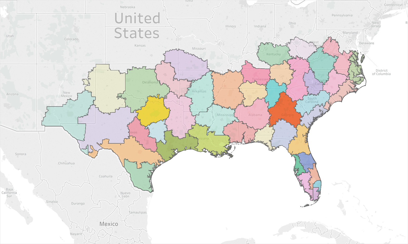
Below is a map that is generated by the K-Means algorithm attempting to minimize the variance of geographic location across these clusters, with only minimal influence of sales volume allowed. From this toy model we can see that store density can affect the district size—a large number of stores in population-dense areas means smaller districts (and a high store count), while fewer stores in rural areas result in bigger districts with longer travel time but few stores.
It’s tempting to throw everything into a model like this and see what it comes out with, but often the results leave something to be desired. Each additional factor added to the model can allow for extra constraints, but they also add complexity and must be carefully balanced. Often, the right answer lies somewhere between these kitchen-sink models and the simple geographic one above.
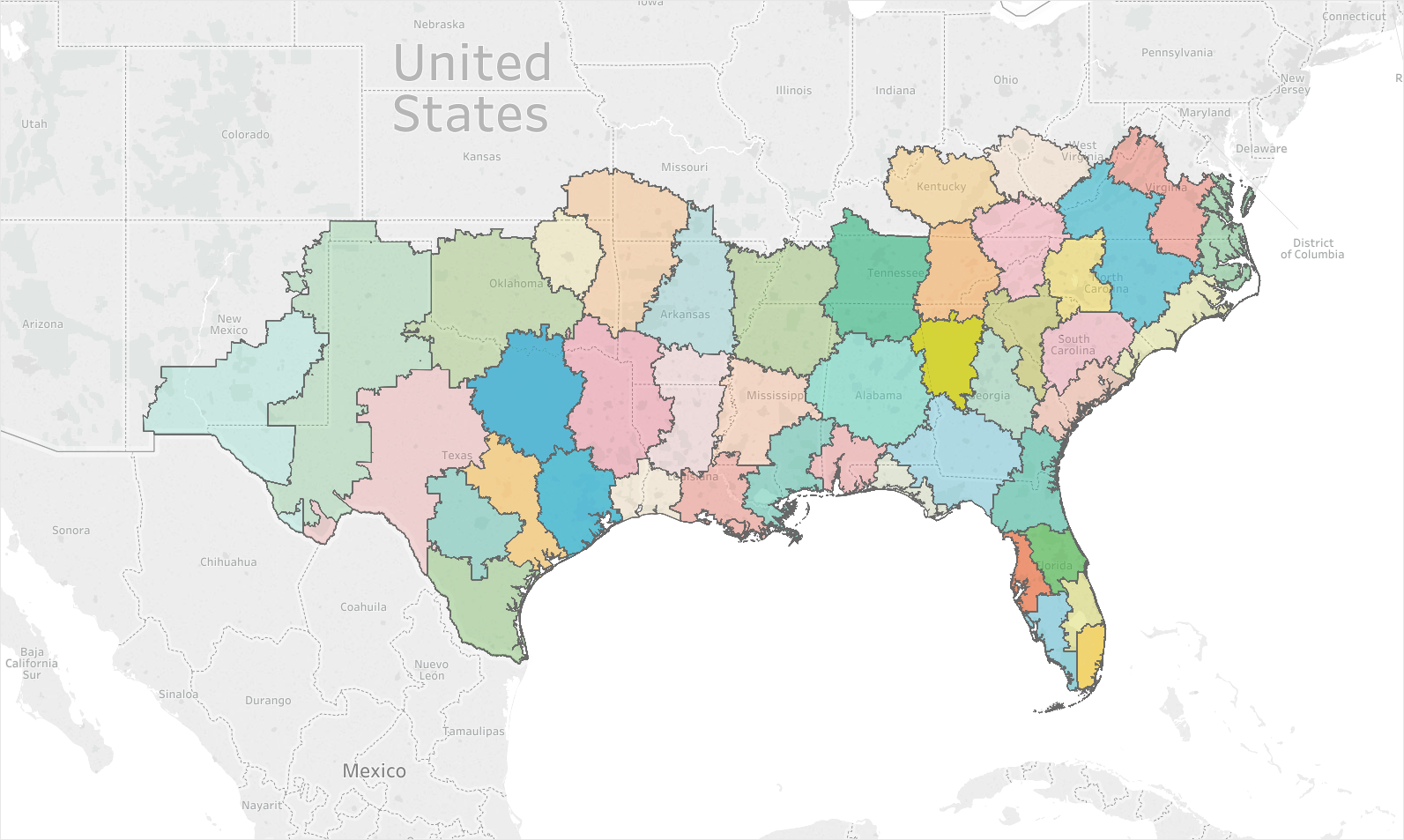
Below are three different examples of how adding in factors can greatly change the maps created. The first image shows how heavily weighting the inventory sold can cause districts to take on a ‘gerrymandered’ effect. As the weight of location and travel time increases, so does the coherence of the districts created. Image 2 shows 2.5x the geographic weighting of Image 1, and Image 3 has 5x the geographic weighting. For some companies with widely varying inventory and store complexity, a map like Image 1 may be ideal. For others, Image 3 may be the better balance.
Image 1: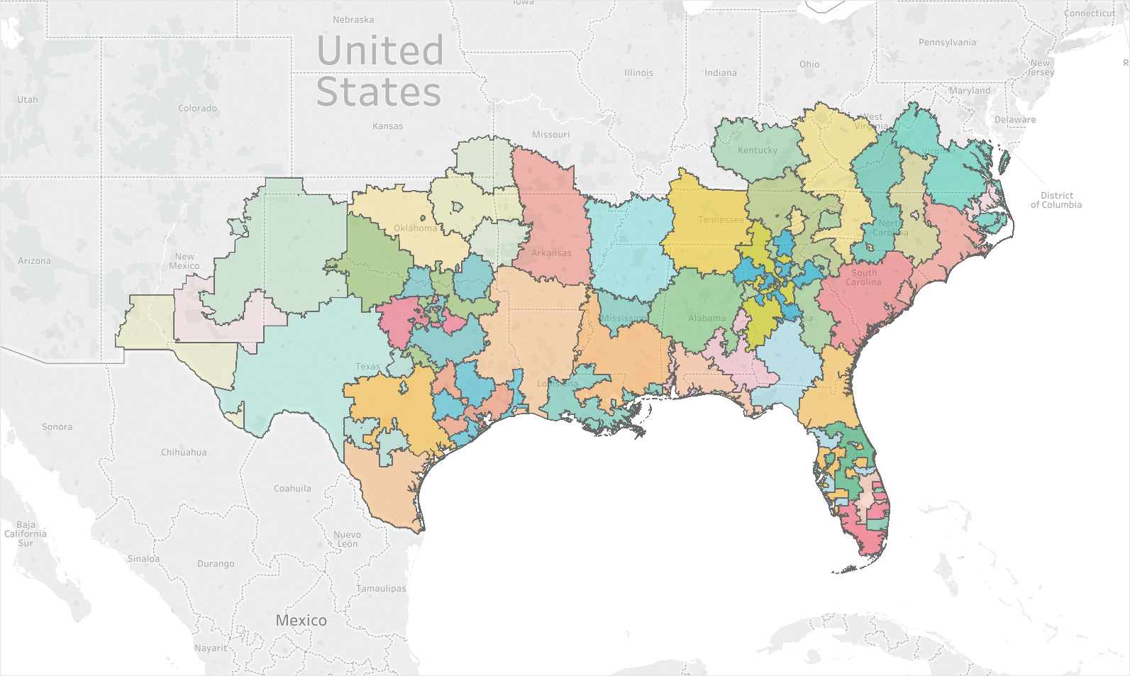
Image 2:
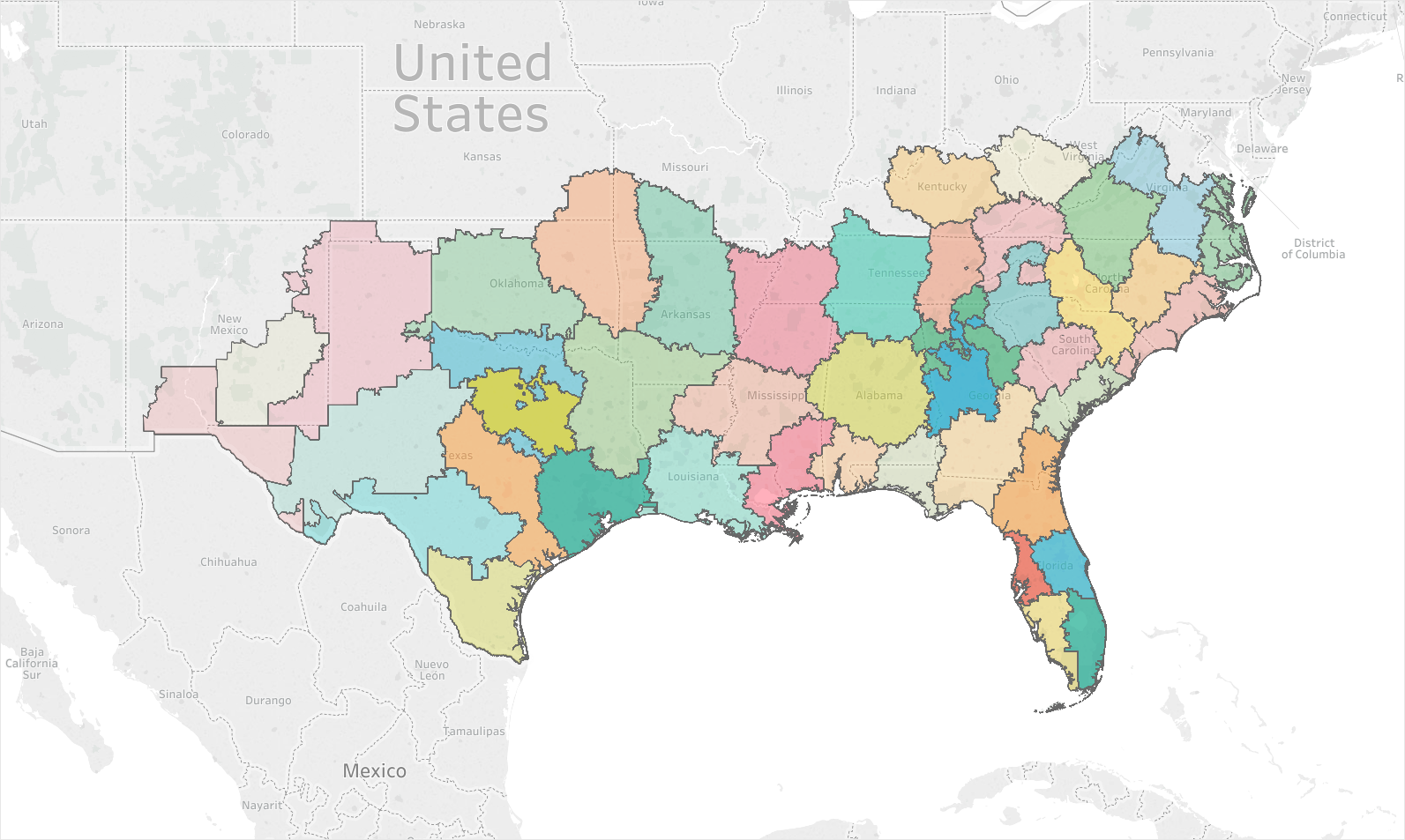
Image 3:
At the end of the day, none of these mappings can be objectively correct—everything comes down to what the business priority is. Often, exercises like this require evaluation of many potential options alongside each other. This allows the business to ensure that intangibles that can’t be represented in data are incorporated into the final results. Methods like the ones shown here, however, can easily be used to kick start the conversation and ensure that some level of objectivity is present in the final results.
Many opt to perform this exercise manually—as stores open and close, there may be some reshuffling of assignments. The pen and paper work can be challenging and may not take into account all the needed factors, which often results in assignments that are far from optimal.
For example, a retail chain was hoping to reorganize its districts to better rebalance the travel time that its district managers had to drive between stores, while making sure that the workload was evenly distributed. At its heart, this is an optimization problem—there is a list of constraints such as minimum and maximum store count, total geographic area maximum, sales volume for stores, etc. The solution is to build out one of several problems that attempts to cluster stores together based on parameters, or alternatively minimize constraints to generate several options for what a new alignment of stores to district managers would look like.
Below is a map that is generated by the K-Means algorithm attempting to minimize the variance of geographic location across these clusters, with only minimal influence of sales volume allowed. From this toy model we can see that store density can affect the district size—a large number of stores in population-dense areas means smaller districts (and a high store count), while fewer stores in rural areas result in bigger districts with longer travel time but few stores.
It’s tempting to throw everything into a model like this and see what it comes out with, but often the results leave something to be desired. Each additional factor added to the model can allow for extra constraints, but they also add complexity and must be carefully balanced. Often, the right answer lies somewhere between these kitchen-sink models and the simple geographic one above.
Below are three different examples of how adding in factors can greatly change the maps created. The first image shows how heavily weighting the inventory sold can cause districts to take on a ‘gerrymandered’ effect. As the weight of location and travel time increases, so does the coherence of the districts created. Image 2 shows 2.5x the geographic weighting of Image 1, and Image 3 has 5x the geographic weighting. For some companies with widely varying inventory and store complexity, a map like Image 1 may be ideal. For others, Image 3 may be the better balance.
Image 1:
Image 2:
Image 3:
At the end of the day, none of these mappings can be objectively correct—everything comes down to what the business priority is. Often, exercises like this require evaluation of many potential options alongside each other. This allows the business to ensure that intangibles that can’t be represented in data are incorporated into the final results. Methods like the ones shown here, however, can easily be used to kick start the conversation and ensure that some level of objectivity is present in the final results.